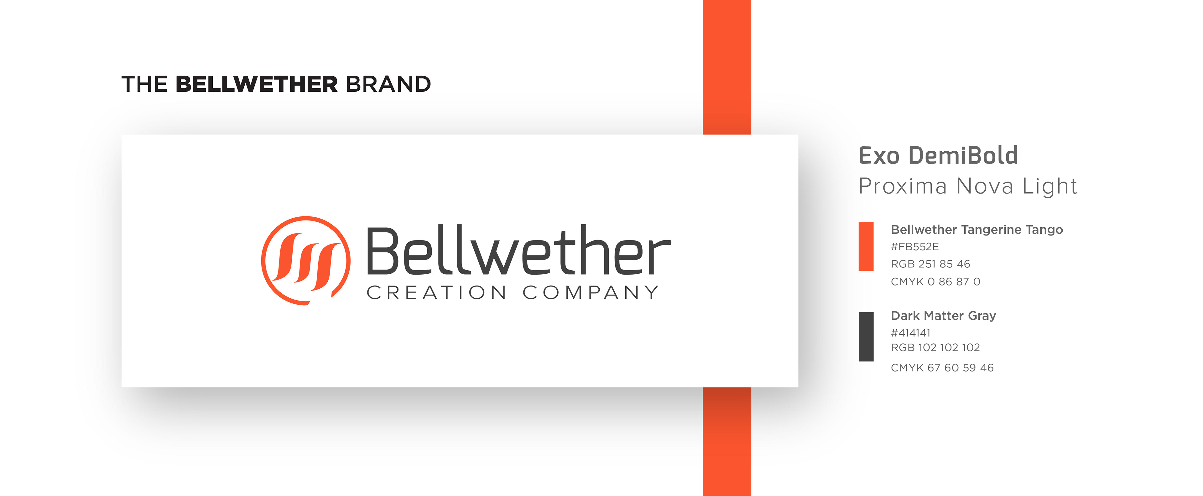
BRANDING NOTES:
• “Bellwether Tangerine Tango” is a variety of Tangerine Tango on steroids. We tweaked it to be demand attention and possess a vivid burn digitally. Our color exhibits the enthusiasm we provide and stimulate our audience to dive deeper into the Bellwether experience.
• The three pronged, circled wave mark signifies a “new wave” of product engineering and has forward motion to it.
• The circle suggests our wide range of services from product conception to deployment (The full circle of product engineering). The three marks inside are symbolic to the most important three: Design, development, and direction.
• We loved the futuristic/techy implications of the Exo font and thought it would be emphasized well above a wide tracked, Proxima Nova Light.

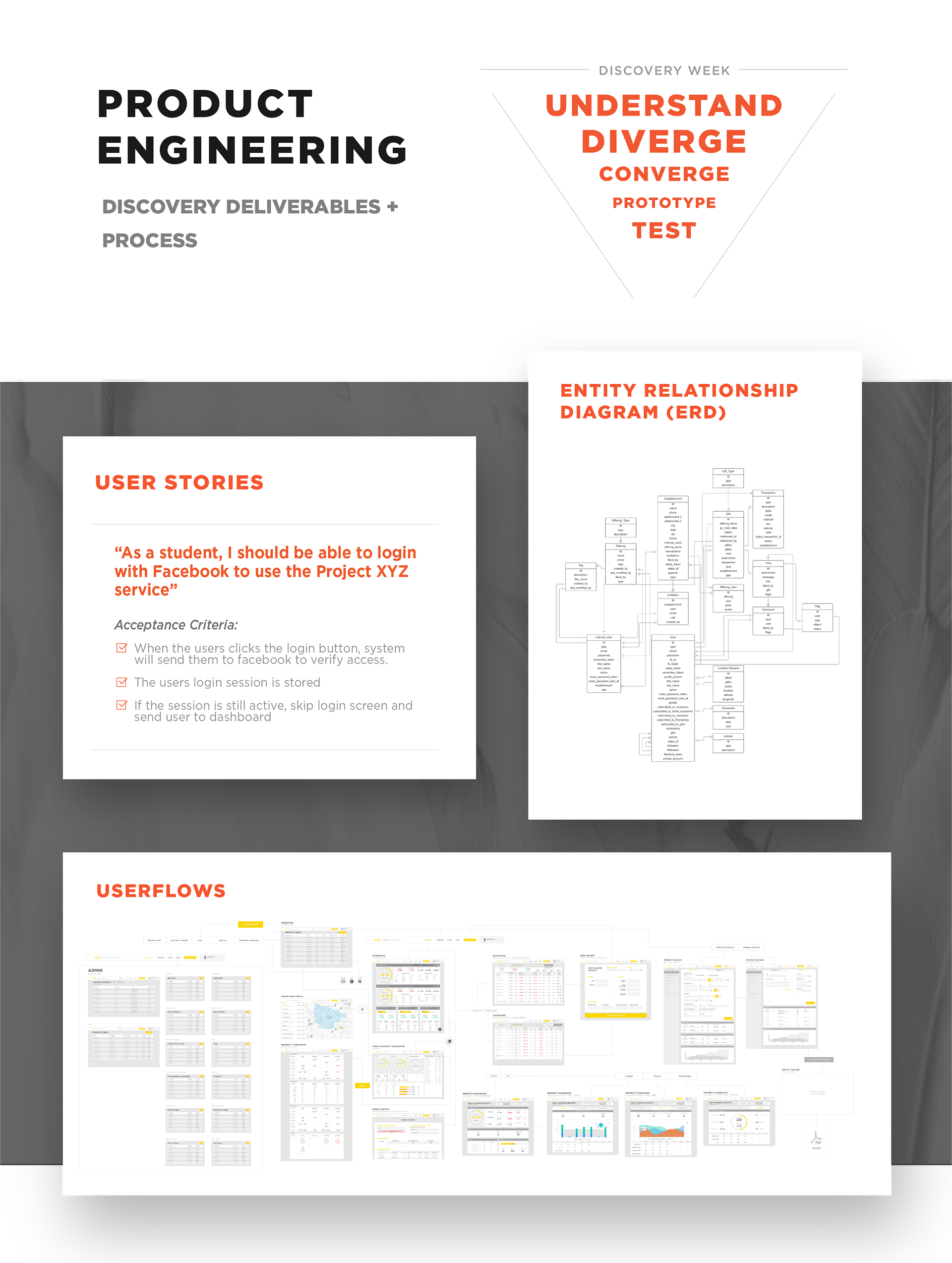
DESIGNATION PRESENTATION
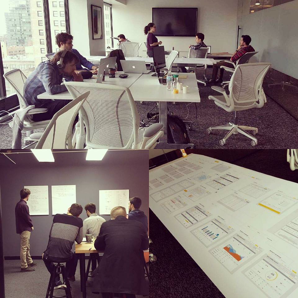
This presentation was created when we hosted the graduating class of UI/UX Designers from Designation Chicago. This deck has a lot of elements from our marque deck that we pitch to new clients and partners. The goal was to give a general overview of Bellwether, show our process/projects, and really hone in on what it would be like to join The Bellwether Creative Team.
Our Culture: The Sum of Our Squad
A huge source of our energy at Bellwether was sprouted from our people. Every member of the "squad" brought their own unique contribution to our projects, process, and overall success. Being a "Bellwether" in your role was everyone's collective goal.